
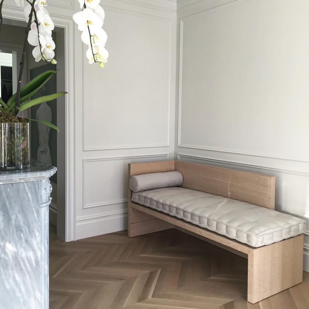
When a Flat Painted Wall Isn't Enough
Here in North America we live in a postmodern world where new, slick and minimal is what many people want. Or at the very least, it's what everyone is left with to desire. Sometimes, though, all those clean hard lines and polished surfaces are just too, well, clean and polished. Where Europe has embraced their heritage and adapted their modern lifestyles to live within the classic designs of their homes, buildings and cities; North America has kept only facades of what were once amazing structures, displaying rich history through it's architecture and design. Our cities have taken down the ornate poetry of history and replaced them with steel and glass cubes. A bit dramatic, I know. But not far from the truth. Though there are many respectable exceptions to that observation, as well as many respectable reasons behind it all, we are indeed living with an abundance of flat painted walls. However, there has been a change in the tides lately, wherein appreciation for delicate classical moldings, herringbone floors and ornate decoration, is moving to the forefront of interior design and architecture. There is, of course, no shortage of the new, slick and minimal, but we are all starting to understand that there is no reason we can't live with both.
Well versed practitioners of this sophisticated mix of design history are everywhere in architecture and design. Joseph Dirand, Jean Louis Deniot and Double G Architecture, all Paris-based design talents, are a few of the best designers of this aesthetic. Local Canadian designers like Nam Dang Mitchell and Ste. Marie Art + Design are design icons in the making for their work in modern and classic interplay. Design history was my favorite class in design school and so it goes without saying that I am a true lover of the entire spectrum and history of design. The Bauhaus Movement in Germany, Italian Brutalism, Europe and America's Midcentury Modern Era, Gothic Cathedrals of the world; you name it, I can't get enough of it. I will say that the Art Deco visual design style of the 20s, 30s and 40s is without a doubt, my favorite - but that nerd-out is for a later post. So for now, clickity click below and feast on some ridiculously awesome examples of this design approach.


1. Interior by Jean Louis Deniot | 2 & 8. Interiors by Joseph Dirand | 3. B&B Italia - Maxalto Credenza | 4. Boboli boutique - Interior by Ste. Marie Art + Design | 5. Club Le Roy Helsinki - Interior by Joanna Laajisto | 6. Interior by Nam Dang Mitchell | 7. Interior by Gilles & Boissier | 9. Interior by Double G Architecture
Starting today I will be in and out of Once A Tree Furniture's showroom putting together my designer room showcase and preparing for the unveiling of the space this coming February 25th. If you haven't already, RSVP at marketing@onceatreefurniture.com to ensure you're on the guest list for that iconic event. Cus you know you don't want to miss it. Be sure to keep following me on Instagram @dexdolores for the behind the scenes action leading up to the big day. And lastly, if you're in dire need of some interior design guidance, go ahead and send me an email. You won't regret it. What are you waiting for?!
:)
Happy Friday everyone!